
Problem
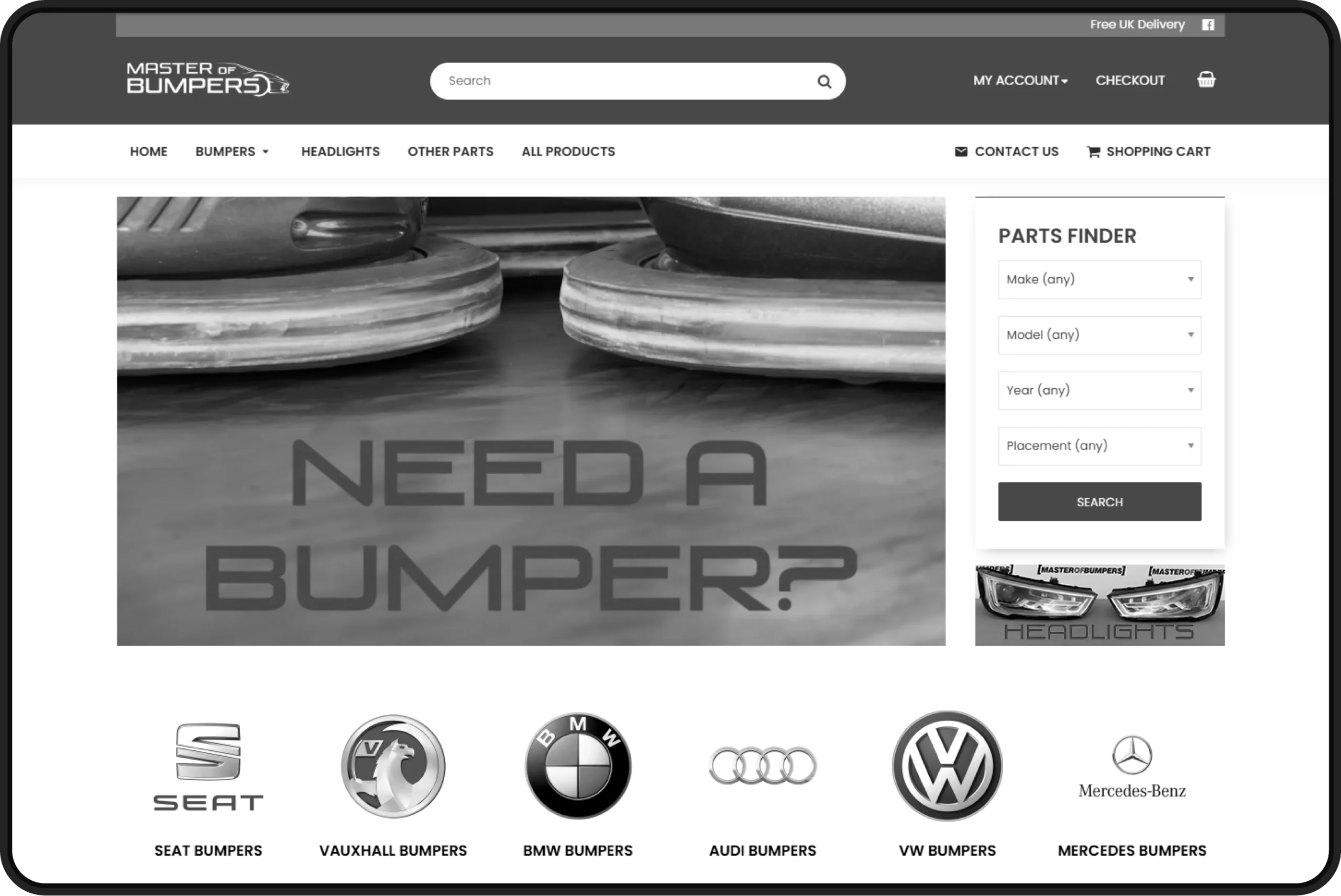
The original website felt dated and did not reflect the quality of the products or the brand’s credibility. Product discovery was slow, navigation lacked clarity, and the experience did not scale well for a growing inventory. The client needed a modern e-commerce experience that would build trust quickly, support thousands of products, and encourage customers to buy directly rather than rely solely on third-party marketplaces.
Key challenges
- 1Structuring and managing a catalogue of over 3,000 automotive parts
- 2Designing within the technical constraints of the OpenCart Journal theme
- 3Making vehicle-specific parts easy to find
- 4Translating marketplace trust into confidence on a standalone website
Collaboration
This project was delivered in collaboration with Nanet Websites, who managed server infrastructure and developed custom OpenCart plugins. I worked closely with them throughout the process, designing and testing layouts on a staging server to ensure smooth technical and visual integration.
Research & insights
Rather than formal user testing, the project relied on UX best practices and behavioural patterns common in automotive e-commerce. Users want speed, clarity, and reassurance. The design needed to minimise friction when searching for compatible parts while clearly communicating credibility and scale. Key insights included:
Design process
I began by sketching wireframes and creating staged mock-ups on the development server. Working within OpenCart and the Journal theme, I refined the layout to align with the platform’s structure and theme capabilities.


The design focused on speed, clarity, and trust, ensuring users could find the right automotive parts with minimal effort. Early wireframes prioritised product discovery and informed the homepage structure.
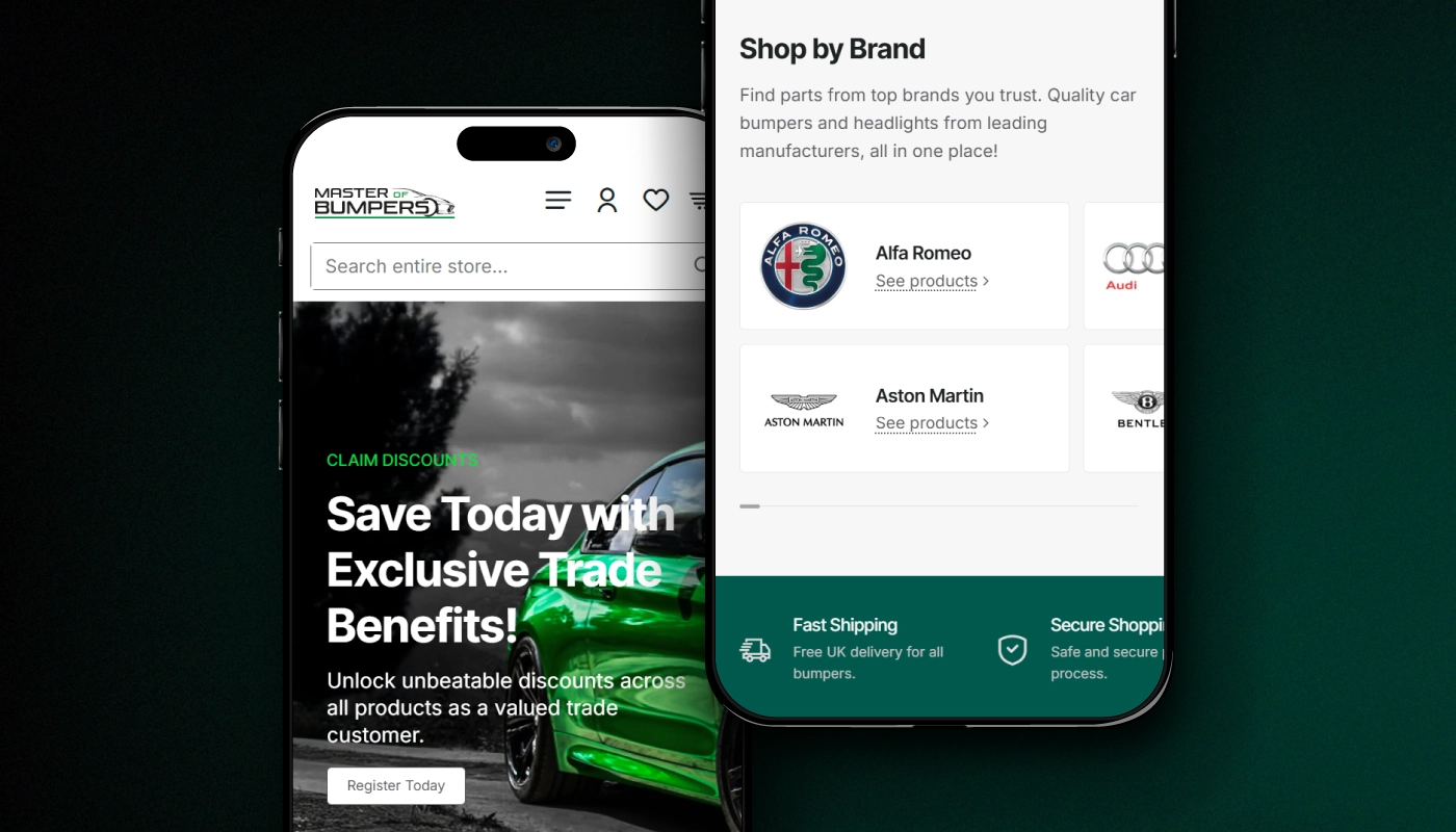
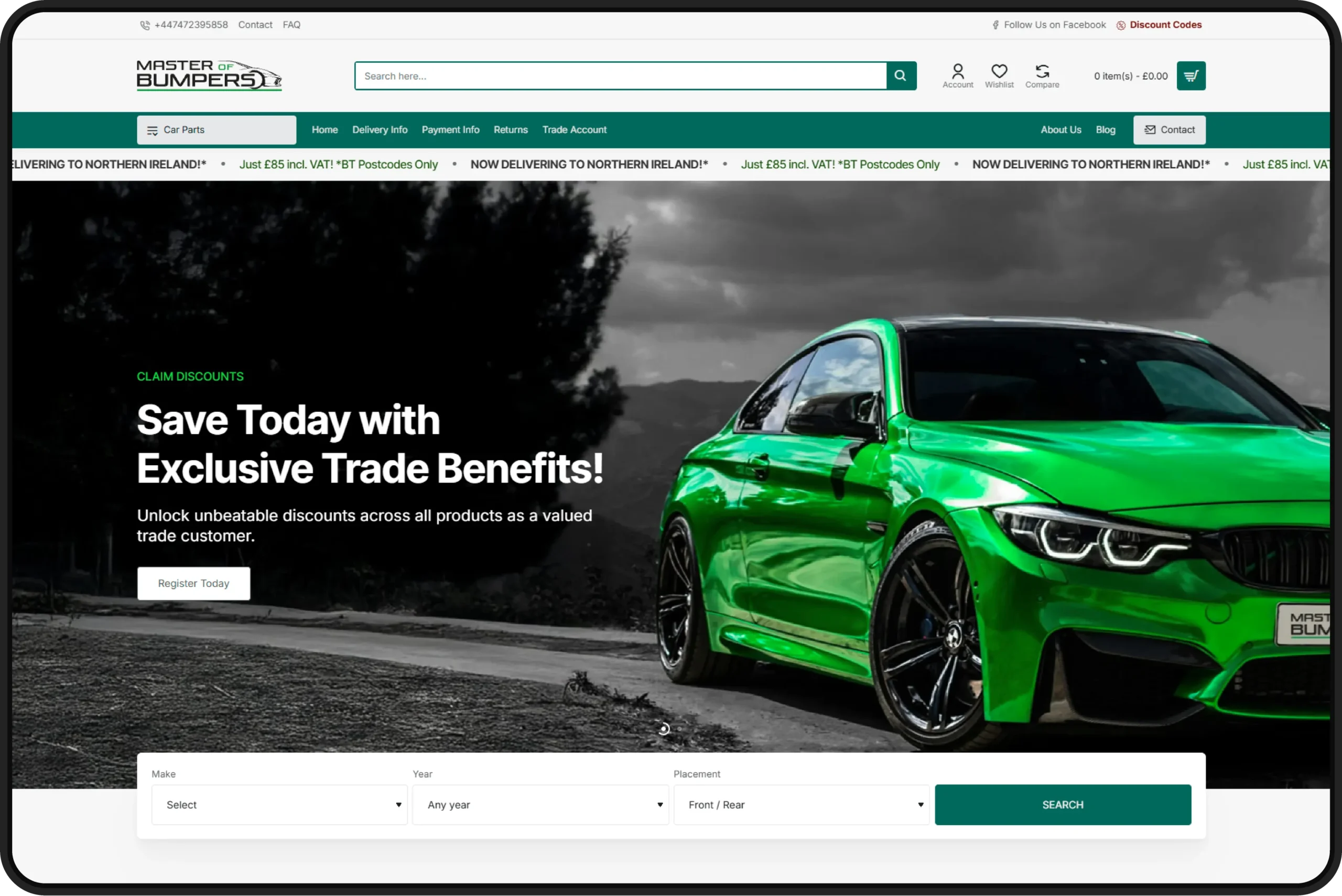
A key UX feature is the vehicle-based quick search, allowing users to filter parts by Make, Year, and Placement (Front / Rear). This mirrors real-world user behaviour and significantly reduces friction when navigating a large catalogue.

For users who prefer browsing, I introduced a “Shop by Category” section, presenting core product groups as clear visual entry points and helping users quickly understand the range available.

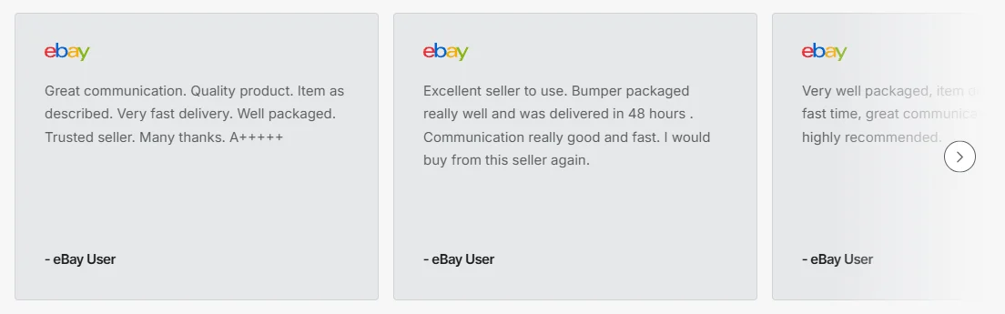
To build credibility, I integrated eBay customer reviews directly into the homepage, leveraging the brand’s long-standing marketplace reputation to increase trust and confidence in direct purchases.
The visual design uses the brand’s green #00695C for key actions and highlights, balanced by black and white paired with Inter Tight for headings and Inter for body text. All layouts were refined within the OpenCart Journal theme and optimised for responsive, mobile-first use.
Key actions
Results
The final website delivers a clean, modern e-commerce experience that reflects Master of Bumpers’ expertise and values. Clear navigation, fast product discovery, and strong visual hierarchy support confident purchasing, while the responsive layout ensures usability across all devices. The platform is scalable, maintainable, and ready to support long-term growth beyond online marketplaces.
Impact & reflection
The redesigned website enabled Master of Bumpers to transition from a marketplace-focused business to a dedicated e-commerce platform capable of supporting thousands of products and integrated marketing campaigns. Structuring such a large catalogue reinforced the importance of UX clarity at scale.
What I learned
This project strengthened my ability to design within technical constraints while delivering a polished, user-focused experience. It also highlighted how thoughtful UX and trust signals can directly support conversion and long-term business growth.




What I do